POWERPOINT PRESENTATION: HEADLINES & VISUALS

Headlines and visuals can be very powerful. Title slides are statements that help advance your story. Visuals support your story structure. They can entice or bore the audience. In this post you’ll learn how to elevate your ideas and at the same time narrow your audience’s focus. You’ll discover ways to turn on the audience imagination with the effective use of headlines and visuals.
Welcome to my blog where you will learn a thing or two about Presentation Design. Read on…
HEADLINES
Your headlines should pull out your main concept and place it at the top of the slide. The title should clearly summarize the key insight. Each title should build on top of the previous creating a flow that moves the story forward with each passing slide. I’m willing to bet that the last deck you designed had lack luster, passive titles. Like, “Update, Sales Report, Next Steps, or Customer Behavior. Ammi-right? Or ammi-right?
This type of title does not move your story forward. Vague titles make your audience work too hard to decipher the message. Titles have the best real estate in the whole slide, let’s make good use of it. Titles need to be more active. First pull back from your whole presentation layout and see how it is fitting together. Pick out your key elements and make it flow. Consider titles with no images or charts to support. Make your titles work for your story. Stand alone headlines tell the story so well that someone can leave the room for a couple minutes. And, when they come back they are right back into the flow of your presentation. They don’t have to say, “What did I miss?”
Headlines build the framework of your PowerPoint Presentation. Composed headlines will also keep you oriented as you are presenting. Unexpected interruptions happen, your headlines can support the story and bring you right back in the moment. Clever simple prompts will act as breadcrumbs to keep on the trail.
The best headlines for your story are conversational and concise. Be specific. Eliminate wordiness, include a key data point, and sound natural. Newsworthy. They should be an invitation for the audience to know more.
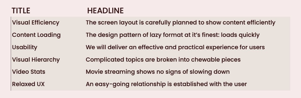
TITLES VS. HEADLINES
See the difference? Headlines not titles. It transforms the title into something the audience can lean into and learn more. I know headlines have more words, and slides have little room to spare. It’s this extra information that guides the audience through the story.

VISUALS
Visuals help us remember things. And, science has proven that the human brain processes imagery faster than the written or spoken word. We respond quickly and emotionally to imagery. Visuals are more easily understood and can refine ideas. Visuals have to be strong or you can end up with a pretty ugly presentation.
In order to advance your story, you’ll want to use two or more of photos, diagrams, data, text, and video.
TEXT
Your audience is not going to read slides during a presentation. They are going to skim, so use text sparingly. Text is a very attractive visual. Text looks best with lots of white space around it. Use visual hierarchy. Let your text breathe. Many slides end up packed with bullet points and the audience cannot take it all in. Don’t over use!
ICONS
Icons are a small graphic representation of an idea or concept. They support the text or content and help clarify the main message. Icons are easily understandable; your audience not get bogged down reading words. They help with the forward movement of the story.
PHOTOS
Photography adds a human aspect to a presentation. And can be very powerful in conveying your ideas. Photos elicit an emotional response from an audience. Especially if you're presenting data or facts about people.
DIAGRAMS
Diagrams are great for grouping information into smaller chunks. Diagrams create a visual explanation of a key message or timeline. It’s another option aside from graphs and charts.
DATA
Charts, graphs and tables present data. There are other ways, be inventive–make your own. Try using varying sizes of type, numbers and shapes to depict your data. You’re not obligated to use only what PowerPoint offers.
VIDEO
Properly used and inserted in the right spot, video can work well to change the pace of your story. Videos are best applied at the beginning or end of your presentation for an impactful start or close. If you decide to insert video mid-presentation, rehearse it well so it will not disrupt your flow.VISUALS SHOULD BE BALANCED
Don’t get stuck on one image so you’re bending your story around it. Find the right image. Be open and make your visuals fit your story not the other way round. Keep it simple and be sure the image directly supports your story. Try not to be repetitive. Do overdo one type - not too many photos, charts, graphs, or text heavy slides. Variation is the key. Be mindful in choosing your visuals.
Overall you do not want your deck to look patched together and uneven. Randomly placed visual choices don’t elevate the story. Your photos and visuals should look like they are from the same collection. A high contrast photo dictates you keep that same theme throughout your presentation. Or if you are using vibrant colors then a black and white photo would not be the best fit. Placement of visuals on the slide in an orderly fashion.
DON’T DIY
Preparing and designing a PowerPoint slide presentation takes hours. You can spend many hours and still find you still have a handful of homely slides. It’s often thought that anyone can create a PowerPoint presentation, if they can work in Word. Surely PowerPoint can’t be too difficult. To create an effective deck it takes a very specific skillset. These skills include: Business understanding, critical thinking, graphic design, layout, typography, content writing, hierarchical understanding, and strategic communication. Designing a presentation is complex job. It requires many skills. So, why not leave to a professional? Like me!